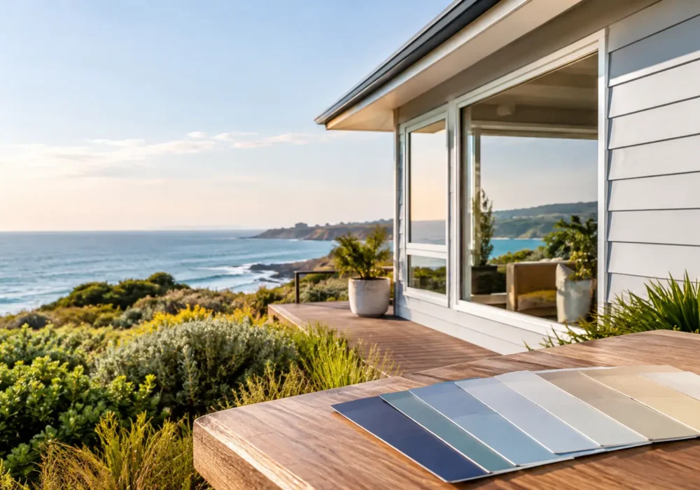
A colour that looked perfect on a small swatch can feel completely different once it covers a weatherboard façade, rendered wall or brick garage. Exterior colours need to work harder than interior shades. They are exposed to changing light, rain, wind, salt air in coastal areas and the everyday wear that comes with a busy property.
Choosing well is about more than following a trend. The right scheme should suit the home, complement the surrounding streetscape and work with the materials that are staying in place. Just as importantly, it needs a properly prepared surface and a quality paint system behind it, so the finished result continues to look cared for.
Start with the fixed features of your home
Before looking at paint cards, take stock of the features you are not changing. Roof tiles or Colorbond roofing, brickwork, paving, stonework, window frames, gutters and fencing all influence the colours that will feel right on the property.
A warm red or brown brick, for example, usually sits more comfortably with warm whites, soft greys with a beige undertone, earthy greens or deep charcoal accents. Cooler grey brick and contemporary roofing can suit crisper whites, blue-greys and clean charcoal shades. The aim is not necessarily to match every element, but to avoid colours that fight with them.
Older weatherboard homes often have more scope for contrast between the main body, trims and front door. On a newer rendered home, a quieter two-colour palette may look more considered. It depends on the architecture, the amount of detail and how prominent the home is from the street.
How exterior colours change in natural light
Natural light is one of the biggest reasons colour choices can surprise people. A sample viewed under showroom lighting is not the same as a full exterior wall in the strong Victorian sun. North-facing areas generally receive more direct light and can make colours appear lighter or brighter. South-facing walls are cooler and more shaded, which can make the same colour read deeper.
Test potential colours where they will actually be used. Paint a good-sized sample board, or use sample pots on a prepared section of wall where practical. View it in the morning, around midday and later in the afternoon. Also look at it from the footpath and driveway, not only up close.
Whites are a good example. A very bright white can look sharp and modern in one setting, yet glaring in full sun or too cool beside cream brickwork. Softer off-whites can feel more forgiving, particularly on larger homes and traditional façades. Grey is equally variable: some greys pull blue, others green or brown, and those undertones become clearer outdoors.
Think about the whole elevation, not one wall
The front of the house may receive different light from the sides and rear. If the property has deep eaves, verandahs or a covered entry, trim colours can appear darker than they do in an open area. A professional colour consultation or experienced painter’s eye can help identify these differences before the painting starts.
This is especially useful when repainting an entire home. Changing the main wall colour without considering fascias, gutters, window trims, downpipes and doors can leave the exterior looking unfinished, even when each individual colour is attractive.
Choose a simple colour hierarchy
Most homes benefit from a clear order of importance. The main colour covers the largest areas and sets the overall mood. Trim colours frame the home and can either blend in quietly or add definition. An accent colour, often used on the front door, gate or selected architectural detail, brings personality without overwhelming the façade.
For many properties, two main exterior colours plus one accent is enough. More detail can suit heritage homes with decorative timberwork, but it needs careful balance. Too many competing colours can make a home look busy and create more maintenance points over time.
Darker colours are popular for doors, fences and feature cladding because they create contrast and can give a home a contemporary edge. The trade-off is that dark paint absorbs more heat and may show dust, salt residue, fading or surface imperfections sooner than a mid-tone. This does not mean dark shades should be avoided. It means surface preparation, product selection and realistic maintenance expectations matter.
Consider the local environment
Across Wyndham, Hobsons Bay, Greater Geelong, the Bellarine Peninsula and the Surf Coast, homes can experience strong sun, wind and varying levels of salt exposure. Coastal conditions can be demanding on exterior paintwork, particularly timber windows, fascias, eaves, weatherboards and metalwork.
Lighter and mid-tone exterior colours are often practical choices for exposed walls because they absorb less heat and tend to age more gently. On the other hand, a darker feature colour may be ideal in a protected entry or on a front door where it delivers the look you want without covering a large sun-exposed area.
The condition of the substrate matters as much as the colour. Weathered timber, cracked filler, failed caulking, rust spots and peeling paint will not be fixed by another coat alone. Washing, sanding, filling, gap sealing, spot priming and minor timber repairs provide the stable base that helps the new finish perform as intended.
Match the paint system to the surface
Weatherboards, render, brick, timber trims, steel gates and fibre-cement cladding each need the right preparation and coating approach. Some surfaces need a dedicated primer for adhesion or stain blocking. Previously painted surfaces may need careful checking to ensure the existing coating is sound.
This is where a colour decision becomes a painting project rather than simply a paint purchase. A quality topcoat will only last as well as the surface underneath it. Thorough preparation is not the glamorous part of an exterior repaint, but it is often what makes the difference between a tidy result for a season and a finish that holds up for years.
Respect the character of the property
A full repaint is a chance to refresh a tired exterior, but not every home needs to be made ultra-modern. Heritage homes, period cottages and older weatherboard properties often look their best when their original proportions and details are respected. Traditional palettes can still feel fresh when the colours are selected with restraint.
For investment properties and commercial buildings, the priorities may be different. A neutral, durable scheme can appeal to a broader range of tenants or customers and make future touch-ups simpler. Schools, places of worship and community facilities often benefit from colours that are welcoming while remaining practical for high-use areas.
Street appeal matters, but it does not require copying the house next door. Look for a scheme that sits comfortably within the area while giving the property its own clean, well-maintained identity. If there are owners corporation rules, heritage considerations or commercial branding requirements, confirm those early rather than after colours have been selected.
Avoid the common colour-selection shortcuts
Choosing a colour solely from an online image is risky. Screens vary, photos are edited and exterior light changes the result. It is also worth being cautious with a colour that is fashionable only because it is everywhere at the moment. A repaint is a significant investment, so the scheme should still feel right after the trend moves on.
Another common shortcut is selecting paint before deciding what repairs are needed. Replacing damaged timber or repairing sections of trim may alter how much contrast is appropriate. Similarly, if old gutters, a roof or paving are due to be replaced soon, factor those future changes into the colour plan.
At Seaview Painting Services, colour matching and practical advice are considered alongside the condition of the surfaces, not separately from them. That approach helps homeowners make decisions that suit both the appearance and the long-term maintenance of their property.
Make the final choice with confidence
Narrow your options to a small group, test them outdoors and give yourself time to look at them under different conditions. Consider how the main colour, trims, roof and front door read together from a distance. A choice that feels calm and balanced across the whole home will generally serve you better than one dramatic sample viewed in isolation.
When you are ready to repaint, make room in the plan for the work that comes before the final coats. Careful preparation, suitable primers and clean application give your chosen exterior colours the best chance to look sharp through changing seasons – and make coming home feel that bit better every day.