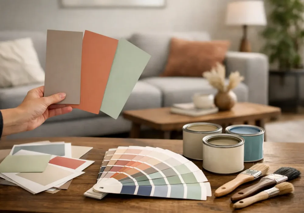
The same soft grey can look calm and tailored in one living room, then cold and slightly purple in another. That is why knowing how to choose paint colours for living room walls is less about finding a popular shade online and more about understanding the room you actually live in – its natural light, existing finishes and the atmosphere you want to create.
A living room is often where the household settles at the end of the day, welcomes visitors and spends quiet weekends. The right colour should support all of those uses. It also needs to sit comfortably with your flooring, furniture, artwork and window coverings, rather than compete with them.
Start with the feeling you want from the room
Before looking through paint cards, decide how you would like the space to feel. A light, open and relaxed room calls for a different palette to one designed to feel cosy, formal or dramatic.
Warm off-whites, soft beige, muted greige and gentle clay tones can make a living room feel inviting without becoming overly yellow or heavy. They work particularly well in homes with timber flooring, natural fibres and warm lighting. Cooler whites, pale blue-greys and clean neutral greys can suit contemporary interiors, although they need enough warmth elsewhere in the room to avoid a stark result.
For a more grounded look, consider mid-tone greens, blue-greys, earthy terracottas or deep charcoal. These colours can add real character, especially in larger rooms or spaces with good natural light. The trade-off is that darker colours absorb light, so they may make a compact or poorly lit room feel smaller. That is not always a reason to avoid them – a dark, cosy living room can be exactly the right choice – but it should be deliberate.
Assess natural light before choosing a colour
Light changes paint more than most people expect. A colour viewed under bright showroom lighting or on a mobile screen is not a reliable guide to how it will appear on your walls.
In southern Victoria, living rooms often receive very different light depending on their orientation. North-facing rooms generally enjoy warmer, more consistent daylight and can carry both warm and cool colours well. South-facing rooms receive cooler light, which can make blue-based whites and greys appear flatter or colder. In these spaces, a neutral with a subtle warm undertone often feels more comfortable.
East-facing rooms tend to be bright in the morning and softer later in the day, while west-facing rooms can become quite warm and intense in the afternoon. If your living room has large west-facing windows, test colours when the late-day sun is strongest. A creamy neutral that looks restrained in the morning may become noticeably golden by afternoon.
Artificial lighting matters just as much at night. Warm LED globes can soften cool paint colours, while cooler lighting can make warm neutrals look dull or greenish. Look at samples in daylight, under lamps and with the curtains closed before making a final decision.
Test large samples on more than one wall
Small paint swatches are useful for narrowing the options, but they are too small to show a colour properly. Buy sample pots and paint large test areas, or paint sample boards that can be moved around the room. Place them on walls that receive different amounts of light.
Leave the samples up for several days. Check them in the morning, afternoon and evening, and view them beside your sofa, flooring, timberwork and curtains. This simple step often rules out colours that initially seemed perfect.
Work with what is staying in the room
Paint is flexible. Replacing a large rug, expensive sofa, stone hearth or timber floor is not always practical. Start with the elements you plan to keep and choose wall colours that bring them together.
Look closely at undertones. A beige sofa may have pink, yellow, green or grey beneath its surface colour. A grey tile can lean blue, purple or brown. If the wall colour has a clashing undertone, the room may feel slightly off even when each item looks good on its own.
Timber deserves particular attention. Honey-coloured floorboards and jarrah-style furniture generally suit warm whites, soft greens and earthy neutrals. Cool charcoal can work with timber too, but it needs to be balanced with warm fabrics or lighting. For grey concrete-look floors, muted warm whites and taupes often add welcome softness.
If you have a feature such as a brick fireplace, stone mantel or a strong artwork, let it guide the palette. The aim is not to match every colour exactly. It is to choose a wall colour that makes the fixed features feel intentional.
Choose a white with care
White walls are not a single choice. Some whites are crisp and cool, others are creamy, and many sit somewhere between. The wrong white can make trims look yellow, floors look pink or a room feel clinical.
A useful approach is to choose the wall colour first, then select a complementary white for ceilings, doors, skirting boards and architraves. In many homes, a slightly cleaner white on trim provides a neat contrast without making the walls look dirty. In rooms with low ceilings or limited light, using a similar white on walls and ceiling can make the boundaries feel less obvious and create a more open impression.
Pure bright white is often best reserved for modern spaces with strong natural light and a deliberately crisp palette. For many established homes across Werribee, Geelong and the coastal areas, a softened white is easier to live with and more forgiving alongside changing furnishings.
Use feature colours where they add purpose
A feature wall can be effective, but only when it has a reason to be there. The best wall is usually one that naturally draws the eye: behind a sofa, around a fireplace, in a recessed nook or along a wall with architectural detail.
Painting one random wall a darker shade can make the room feel chopped up. Instead, use colour to highlight proportion or create a focal point. Deep olive behind a fireplace, a muted navy in a television alcove or a warm terracotta in a reading corner can give the space personality without overwhelming it.
In open-plan homes, a stronger colour can also help define the living area from the kitchen or dining zone. Keep the broader palette connected by repeating a related tone through cushions, rugs, artwork or joinery.
Think about sheen as well as colour
The paint finish changes how the colour reads and how the wall performs. A low-sheen interior acrylic is a popular choice for living room walls because it has a soft appearance and is generally easier to wipe than a flat finish. It also handles everyday marks better, which can matter in busy family homes or rental properties.
Flat or matt finishes can look refined because they minimise surface reflection, but they may show scuffs more readily and can be harder to touch up evenly. Higher sheen finishes are usually better suited to doors, trims and other hard-wearing areas. Their reflective quality can highlight imperfections, so careful preparation is essential.
This is one reason professional preparation matters before a colour change. Filling dents, sanding rough patches, sealing gaps and priming repaired areas helps light fall evenly across the wall. Even the best colour will not look its best over uneven surfaces.
Create a palette that will last beyond a trend
Trend colours can be a useful starting point, but a living room repaint is worth choosing for the long term. If you enjoy a bold shade but are unsure about committing to every wall, use it in a smaller area or bring it in through furnishings first. Neutral does not have to mean bland – a well-chosen warm white, mushroom, sage or blue-grey can have plenty of depth.
It also helps to think ahead. Are you likely to replace the sofa, update the curtains or sell the property in a few years? A versatile base colour gives you more freedom. Strong colours can still work beautifully, particularly in character homes, but they should suit the room rather than simply follow what is currently popular.
For homeowners who want reassurance before a full repaint, Seaview Painting Services can provide practical colour guidance alongside careful preparation and a quality interior finish. Seeing samples in your own home and talking through the light, existing materials and intended use of the room makes the decision far easier.
A good living room colour should still feel right after the sample cards are gone and the furniture is back in place. Take your time with the testing stage, trust what you see in your own light, and choose a shade that makes coming home feel that little bit better.